Blog · EssayColour · Web platform
Colour you mostly won't see
oklch, Display P3 and HDR on today's screens, with demos you can run on yours
Most of the colour work on this site is invisible, and it should be. Every colour in the site's own theme is written in oklch(). A screen that can show the wider Display P3 gamut gets a little more colour in the few places that can use it. Every other screen gets a finished sRGB design. HDR waits for photos.
I wanted that decision to rest on numbers. So I measured the gamuts, the screens people hold, what browsers support today, what people can perceive, and finally my own stylesheets. The last part found more to fix than I expected.
This post runs live in your browser, so you can check every claim on the screen you're reading it on.
Two words that get mixed up
Gamut is how saturated a colour can get. Dynamic range is how bright it can get. A phone can have both. An OLED monitor can have both. A screen's spec sheet usually lists them together, which is why "wide gamut" and "HDR" blur into one idea. They're separate decisions, with separate CSS, and I treat them separately below.
How much bigger is "wide"?
Quoted figures vary because the method varies. By one widely cited measure of the CIE 1931 diagram, sRGB's primaries cover 35.9% of visible colour, DCI-P3 53.6% and Rec.2020 75.8%.1 When I computed the triangles myself from the standard primaries, P3 came out at 1.36× the area of sRGB and Rec.2020 at 1.89×.2 Measured as volume in CIELAB, which counts lightness too, the ratios were 1.50× and 2.26×.3 That matches WebKit's description of P3 as "around 50% larger" than sRGB.4
Ratios are the useful unit here.5 P3 is a real step up. Rec.2020 is another large step that almost no consumer screen reaches: even NHK's laser-backlit showcase LCD managed 98% of it.6
The average hides the useful part. At a fixed lightness, the extra room P3 gives depends on hue. At the orb's 84% lightness, green gains a lot (sRGB tops out at chroma 0.264, P3 at 0.359), orange gains some (0.109 to 0.138), and blue almost nothing (0.079 to 0.086).7
The screens people hold
Phones went first: every iPhone since the 7 in 2016 has a P3 display.8 Since then wide gamut has spread unevenly. Tablets split inside one brand, laptops and monitors split by price, and even a $350 QD-OLED gaming monitor now fills P3.9 An Android phone's colour can depend on a setting color-gamut can't see: an independent review measured the Galaxy S26 Ultra at 83% of DCI-P3 by default and 97% at its most vivid.10 Much of the installed base is still an office monitor at 99% sRGB11 or a budget laptop at about 65% of sRGB,12 which is less than sRGB itself.
| Screen | What the maker or a measurement says | Gamut for this post |
|---|---|---|
| iPhone 7 and later | "Wide color display (P3)"8 | P3 |
| iPhone 17 | P3, HDR OLED, 1600 nits peak13 | P3 + HDR |
| MacBook Pro, iPad Pro | P3, XDR displays; MacBook Pro 1600 nits HDR peak1415 | P3 + HDR |
| Studio Display | P3, with an sRGB reference mode16 | P3 |
| Galaxy S26 Ultra | 100% DCI-P3 colour volume (Samsung); 83–97% measured, by setting1710 | P3, setting-dependent |
| Galaxy A56 | DCI-P3 listed; 99.1% sRGB measured18 | P3 unmeasured |
| Pixel 10 / 10 Pro | HDR OLED, no gamut published (Google); 10 Pro measured at 73.4% of P31920 | Partial P3 |
| iPad (A16) | sRGB display, no P321 | sRGB |
| MacBook Air (M5) | P3, 500 nits22 | P3 |
| Dell XPS 14 OLED | 100% DCI-P3, DisplayHDR True Black 50023 | P3 + HDR |
| Alienware AW2726DM (QD-OLED, about $350) | More than 111% of DCI-P3, measured9 | P3 |
| Alienware x17 R2, 4K panel (my screen) | 99% DCI-P3 and Dolby Vision (Dell); 94.4% measured24 | P3 |
| Office monitor (Dell P2425H) | 99% sRGB11 | sRGB |
| Budget laptop | 45% NTSC, about 65% sRGB12 | Below sRGB |
I wrote and tested this post on an Alienware x17 R2 with its 4K panel. Dell specifies that panel at 99% of DCI-P3, 500 nits and Dolby Vision; TechSpot's review measured 94.4% of DCI-P3 and found it short of a true HDR display.24 Chrome on it answers p3 for color-gamut, so every P3 rule in this post was checked on that screen.
The traffic leans toward the screens that benefit. Phones carry 58.99% of web traffic worldwide against 39.26% for desktop.25 Apple holds 30.8% of mobile vendor share and Samsung 23.52%.26 On desktop, Windows holds 76.36%.27 Vendor share is a different number from gamut share, and I found no public figure for how many visits match (color-gamut: p3). The direction is clear, though: Omdia expects OLED monitor panels up 79% in 2026,28 and Counterpoint forecasts OLED notebook panels up 50% while the notebook panel market shrinks.29
What browsers support today
Here is what MDN's compatibility data says as of October 2026. Each feature links to its MDN page.
| Feature | Chrome / Edge | Firefox | Safari | Baseline |
|---|---|---|---|---|
| oklch() | 111 | 113 | 15.4 | Widely available, 2025-11-09 |
| color() incl. display-p3 | 111 | 113 | 10.1* / 15 | Widely available, 2025-11-09 |
| color(display-p3-linear …) | 144 | 146 | 26.2 | Not in Baseline data |
| color-mix() | 111 | 113 | 16.2 | Widely available, 2025-11-09 |
| Relative colour (oklch(from …)) | 119* / 122 | 128 | 16.4* / 18 | Newly available, 2024-09-16 |
| contrast-color() | 147 | 146 | 26 | Newly available, 2026-04-10 |
| light-dark() | 123 | 120 | 17.5 | Newly available, 2024-05-13 |
| @media (color-gamut) | 58 | 110 | 10 | Widely available, 2025-08-14 |
| @media (dynamic-range) | 98 | 100 | 13.1 | Widely available, 2024-11-03 |
| @media (video-dynamic-range) | flag only | 100 | no | Limited availability |
| dynamic-range-limit | 136 | no | 26 | Limited availability |
| dynamic-range-limit-mix() | 136 | no | no | Limited availability |
| Canvas 2D colorSpace: "display-p3" | 92 | no | 15.2 | Limited availability |
| ImageData pixelFormat "rgba-float16" | 137 | no | no | Not in Baseline data |
| WebGPU | 113* / 144 | 141* | 26 | Limited availability |
| WebGPU canvas toneMapping (HDR) | 129* / 144 | no | no | Limited availability |
First stable version with support, from MDN's browser compatibility data (@mdn/browser-compat-data 8.1.7, 2026-10-22; Baseline from web-features 3.44.0).30 An asterisk marks partial support or support on some operating systems only ("first / full"). Apple's Safari 26 notes describe its dynamic-range-limit support as partial: standard and no-limit.31*
The colour half of the table is settled. oklch(), color(), color-mix() and the color-gamut query are Baseline widely available, and contrast-color() joined every engine in April 2026.32 The color-gamut query reports what the browser and the output device can show,33 so a P3-capable browser on an office monitor answers srgb. On Windows there is one more layer: Auto Color Management maps apps that don't target wide gamut into sRGB.34
The HDR half is young. dynamic-range-limit ships in Chromium and Safari, HDR canvas output ships only in Chromium, and Firefox has neither yet.3536 Firefox also draws 2D canvases in sRGB only.37
What people notice
A 2026 study at IS&T Electronic Imaging found that observers could consistently tell ultra-wide-gamut images from the same images calibrated to sRGB. The difference between DCI-P3 and ultra-wide gamut was "notably smaller", and spotting it depended more on the content.38 The authors work for a display maker, and the result fits the rest of the evidence: sRGB to P3 is the step people see. Beyond P3 is a smaller step, for some content.
Why I write colour in oklch
hsl() promises a lightness channel and doesn't keep it. At hsl(h 100% 50%), twelve hues run from 45% to 97% perceived lightness.39 oklch() holds lightness steady across hues. That's what lets me raise chroma for P3 screens without the design's tone shifting.
When a colour doesn’t fit
Any colour you write can be outside the screen's gamut. Something has to bring it back. Clipping each RGB channel to 0–255 is fast and bends the hue: an orange at oklch(84% 0.16 60) shifts 7.5° and loses 2.6 points of lightness when clipped to sRGB.40 CSS Color 4 describes reducing chroma in OKLCH until the colour fits, so hue and lightness hold.41
The safest answer is to never ask for colour the screen can't hold. That rule became the centre of this project.
The orb study
The site's navigation is a floating glass orb. Press it and the menu opens. Inside the glass sits a thin iridescent film, like a soap bubble catching light. It is the most saturated moving colour I've designed, and the first thing a visitor touches, so it became the test for everything above.
What it asked for. Eight colour stops round the hue circle, all at 84% lightness. The sRGB rule gave every stop chroma 0.10; the P3 rule gave every stop 0.16. One number for every hue looked tidy in the stylesheet.
What screens could show. The headroom section showed why that fails: room depends on hue. At 84% lightness, green has space to spare, while blue has almost none. Six of the eight P3 stops asked for more colour than even P3 can show, and three of the eight sRGB stops overshot sRGB.42 Every screen clipped each hue by a different amount, so the rainbow came out lopsided on exactly the displays the P3 rule was written for. Nothing looked broken. I found it only because I measured.
How much of it a reader sees. Composited at its stops' own opacity, 50 to 65% over paper, 57% of the P3-rule band falls outside sRGB.43 That is the film at full strength, and the orb rarely shows it. At rest the film peaks near chroma 0.03 in my captured stills, where a P3 phone and an office monitor look the same.44 Open the menu and it flares to about 0.08 for a moment.44 The greens and oranges bloom on a P3 screen and flatten on sRGB. That moment is the only place the P3 rule earns its bytes, so it is the moment worth getting right.
The fix: one cap per hue. Each stop keeps the chroma it asked for, up to 98% of the most its gamut holds at that hue.45
| Stop | Hue | sRGB rule (asked 0.10) | P3 rule (asked 0.16) |
|---|---|---|---|
| Coral | 25 | 0.086 | 0.111 |
| Orange | 60 | 0.100 | 0.135 |
| Yellow | 100 | 0.100 | 0.160 |
| Green | 145 | 0.100 | 0.160 |
| Cyan | 210 | 0.100 | 0.156 |
| Blue | 265 | 0.077 | 0.085 |
| Violet | 305 | 0.098 | 0.107 |
| Pink | 350 | 0.100 | 0.135 |
Yellow and green keep everything they asked for. Blue gets almost nothing from P3, which matches the headroom demo. The 2% margin matters too: with stops exactly on the edge, the OKLab blend between neighbours still grazed past it across 25% of the band. At 98% that falls to zero.46
The decisions that shaped it. The capped film is live on every page.45 Getting the colour right was half the work. The other half was deciding when the colour shows up at all.
- Clear at rest. The faint resting film looks the same on every screen, so the orb keeps its colour for the moments a visitor touches it.
- Colour that answers the hand. Under the pointer the film glows where you are, and its colours drift with your movement. Now and then a band of colour passes across it, an invitation to touch.
- A click you can feel. A press swells the orb a little and lets it settle, like a bubble, while the whole film flares as the menu opens. Closing plays the gesture in reverse.
- A hold that rewards patience. Press and hold, and the colours spin up. Let go, and they glide down to a slow drift that keeps turning.
- An edge made of light. The edge of a glass ball brightens. The first version outlined the orb in grey and it read as a flat disc. Now the edge catches light, with a thin band of colour that gathers on one side and moves with the pointer, as on a soap bubble.
- Quiet on white. At full strength that band looked loud on a white page, so it shows for a moment as the colour passes, then clears.
- Calm for everyone. Readers who ask for reduced motion get the glow without the movement, and none of the motion holds up the page.
The lesson travelled. One chroma for every hue was the orb's bug, and, as the next section shows, it was the site's bug too.
Holding my own site to the same rule
A rule is only worth writing up if the site follows it. So I ran the same check over every colour on fauzul.com that has a P3 override: 38 values in all, 6 in the core tokens and hero, and 32 across the eight industry hues.47
10 P3 values fit inside sRGB. The indigo accent is the clearest case. Its sRGB rule is chroma 0.18 and its P3 rule 0.215, while sRGB itself holds 0.246 at that lightness and hue.48 P3 viewers were getting a more saturated indigo than everyone else, with no wider colour involved. The hero violet and smoke follow the same pattern.48
24 P3 values exceed P3, and 26 of 32 sRGB values already exceed sRGB. These are the industry accents. Every hue shares one chroma recipe, and at those lightnesses yellow-greens, teals and blues have far less room than reds.49 On 7 of the 8 hues, the hover lift asks for colour beyond both edges, so rest and hover clip to the same place.49
4 use real P3 headroom. The media field accent goes from 0.172 to 0.22, a visible gain on a P3 screen.
What I'm changing:
- Delete the indigo, violet and smoke P3 overrides. Every screen gets the same brand colour. On P3 Macs and iPhones the accent gets slightly calmer. On every other screen nothing moves.
- Cap the industry accents per hue. Each sits 2% inside its gamut edge, computed from the same script and passed in as custom properties. sRGB screens stop clipping. P3 screens keep 28 overrides that add real colour.
- Give the hover lift a lever that exists on every hue. Lightness or the glow's opacity can carry the lift where chroma has no room left.
- Request P3 on colour canvases only. A canvas that carries data rather than colour stays sRGB, because a P3 canvas would remap its values.
- Ship the shimmer with capped stops. Done: eight stops, each 2% inside the edge for its hue, so 0 of 8 leave P3.45
The full table, with the before and after for each value, is in data/site_p3_audit.json, and the script that produced it is in scripts/site_p3_audit.py.
HDR, with and without an HDR screen
HDR puts highlights above the page's white. On a screen that supports it, a sunlit edge or a specular glint can be several times brighter than the paper behind the text, while the paper stays where it is.
An SDR screen can't do that, but it can show the ratio by dimming everything else. The HDR demo does both: a simulation for any screen, and a real WebGPU canvas that asks for eight levels from 1× to about 11× SDR white, a half stop apart, with extended tone mapping.50 On an HDR screen in Chrome the bars climb in brightness. Everywhere else they match.
How far they climb is the screen's headroom: its peak brightness divided by the brightness it uses for SDR white. Windows sets that white with the "SDR content brightness" slider, so a 500-nit laptop panel with white near 250 nits has about 2× to give, and every bar past 2× lands on the same peak. A 1,000-nit monitor or a recent MacBook Pro screen shows more steps. HDR also has to be on in the system's display settings; with it off, the browser reports SDR and the canvas draws every bar at white.
HDR on the web arrives in a clear order:
- Video, first. Safari has played HDR video since 14.0 in 2020,51 Firefox on macOS since version 100, with Windows in the Firefox 153 beta.52
- Photos, now. Safari 26 shows HDR images.51 Chromium shows JPEG gain maps, which carry an SDR image plus a map that lifts it on HDR screens. Any viewer without support shows the SDR image.53
- Canvas, in Chromium. WebGPU tone mapping and float16 2D canvas ship there today.3654
- CSS colours, later. The CSS Color HDR module is a Working Draft. It defines
dynamic-range-limitand the PQ and HLG colour spaces, and no browser ships HDR colours in CSS yet.55
dynamic-range-limit is the piece that makes HDR safe to use. Set to standard, it holds an element's HDR content at SDR white. no-limit lets it run. constrained sits between.55 A page can keep thumbnails calm and let a full-screen photo shine.
My plan follows that order. The interface stays SDR, because text and UI on paper gain nothing from extra brightness. HDR comes to the site with photos: gain-map images in project pages, held at standard in grids and set to no-limit when opened.
Generated images, made for every screen
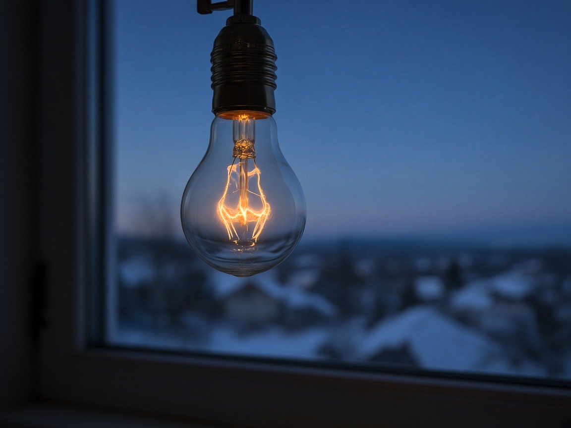
Most images on my site are generated. A generator hands back an 8-bit sRGB JPEG with no colour profile and nothing above white, so a glowing filament stops at the same white as the paper around it. The screens above can show more than that, so I built true-image, a small skill that turns one prompt into three verified files: an Ultra HDR JPEG with a gain map and P3 colour, a Display P3 JPEG, and an sRGB JPEG. A <picture> element hands each screen the best file it can show, and every file still holds a complete SDR picture.
The generator makes the scene twice: once as asked, then as an edit of that same picture about four stops darker, so the brightest parts keep their colour and shape. The skill aligns the two, rebuilds the highlights above white, keeps their detail in the SDR versions, and decodes every file it writes to check it.
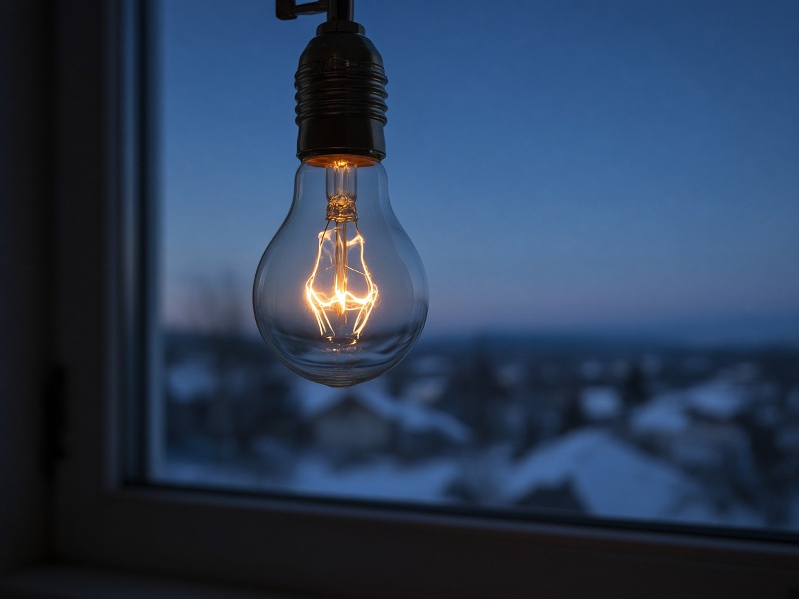
What the generator gave. 8-bit sRGB with no colour profile. The filament stops at the paper's white.
What ships. The browser picks the HDR, P3 or sRGB file for this screen. On an HDR screen the filament runs up to 4.94× SDR white; the HDR file is 182 KB against 99 KB for the sRGB one.
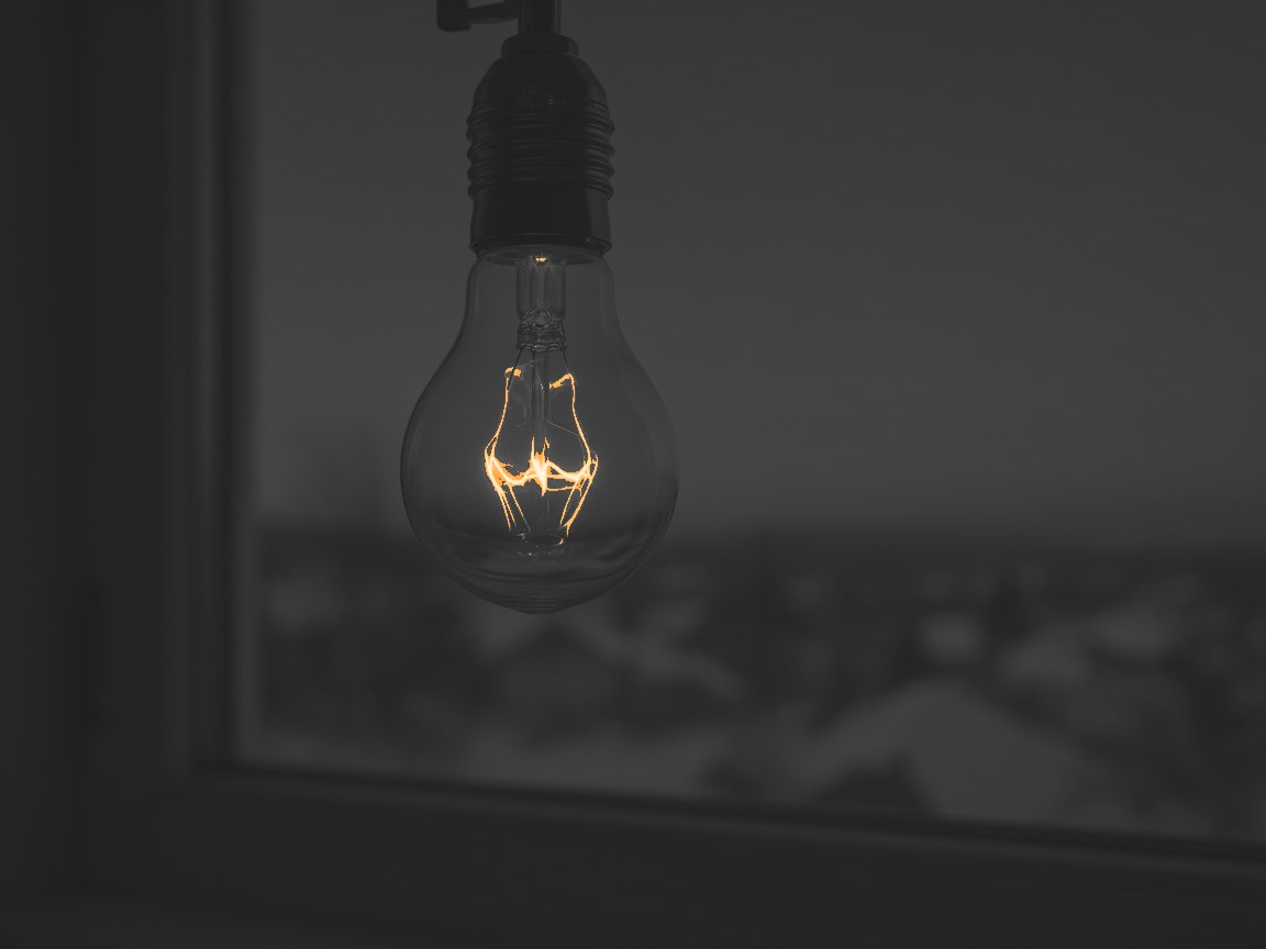
Measured from the HDR file. Lit pixels are the 0.3% that go above SDR white, from amber at 1× to near-white at 8×. Everything else stays at or below white, so the page around it is untouched.
Brightness is half of it. The other half is colour, and the photo demo near the top of this post already shows it: its sample is the mango and lime from this same build, a real Display P3 file. Its colour beyond sRGB lands on the mango's skin, while the counter and the shadows stay where sRGB can hold them.56 Ripe fruit sits right at the edge of sRGB, where P3 has room to spare, and the P3 file costs nothing extra: 163 KB against 164 KB for the sRGB one.
What I do to make a generated image ready for the web:
- Prompt for range. Name a light source or a specular, and colours near the sRGB edge. A pastel or low-key scene has little to lift, and the report says so.
- Edit the picture for the darker frame, never generate a new one. A second generation is a second scene. When the edit moves the scene, I build from the single frame instead.
- Read the report before shipping a tier. Above-white pixels and the peak say whether the HDR file earns its extra bytes. Pixels outside sRGB say whether the P3 file differs at all. Near zero on both, I ship the sRGB file alone.
- Ship a
<picture>with width and height set. Prerender it, and hold it atstandardin grids andno-limitwhen opened. No optimizer touches the files afterwards, because re-saving a JPEG drops the gain map and the P3 profile. - Show readers without HDR or P3 what they miss. Use a measured map, like the third view above. A brightened SDR copy pretending to be HDR would be a fake.
The highlights and the P3 colour in these images are authored, not captured: the darker edit is the generator's idea of what the filament looks like. A camera's bracketed frames go through the same build and give real HDR. Every number above is read back from the shipped files.
Try true-image: see it on your screen and install itSource on GitHub
Who gains from adopting early
The screens people hold decide what the industry builds for. Most visits come from phones.25 Apple and Samsung together carry more than half of mobile traffic.26 Every iPhone since the 7 is P3;8 Samsung's P3 is certain only on its flagships,17 so the share of those visits on P3 screens is lower, by an amount no public figure gives. OLED monitor and notebook panels are growing fast while the panel market overall shrinks.2829 Work made for those screens reaches its audience today. Three kinds of work gain the most.
Design portfolios. The colour is the work. A brand green or orange that sits in P3 shows true on a MacBook or iPhone, and the same page stays finished on an office monitor if the sRGB rule is designed. contrast-color() is now in every engine,32 so text over a saturated brand field can pick its own legible colour.
Filmmakers and cinematographers. Their masters are graded wide and bright, and the web can now carry more of that grade. HDR video plays in Safari and Firefox on macOS,5152 stills can ship as gain maps,53 and a reel page can hold its grid at standard while the player runs no-limit.35
Marketing and content teams. One gain-map asset serves both SDR and HDR screens,53 which keeps a campaign to a single file per image. Saturated greens and oranges, the hues P3 extends most,7 show as shot on the phones most of the audience uses. The care point is the feed: HDR beside body text overpowers it, and dynamic-range-limit holds it back.
Text-first sites, documentation and dashboards can wait. Their colours are near-neutral, and near-neutral colour already fits inside sRGB, so a wider gamut has nothing to add.57
The safest colour bets today
contrast-color() does.Each of these holds on every screen. Six work in every browser in use; the seventh, contrast-color(), is new enough to need a fallback.
- Write colour in
oklch(). It is Baseline widely available,58 and its lightness channel means what it says. - Design the sRGB version first. Office monitors sit at 99% sRGB,11 Windows carries 76.36% of desktop traffic,27 and
color-gamutanswerssrgbfor all of them.33 P3 is a layer on top of a finished design. - Meet contrast before adding chroma. Body text needs 4.5:1 against its background, large text (24px, or about 18.7px bold) 3:1, and interface parts and meaningful graphics need 3:1.5960 WCAG 2.2 is the bar to meet today: the WCAG 3 draft of March 2026 has yet to settle its contrast method.6162
- Pair colour with a second signal. Meaning carried by colour alone fails WCAG.63 About 8% of men and 0.4% of women of European descent have a red-green colour deficiency.64 A status colour gets an icon or a word next to it.
- Keep categories to eight, from a tested set. The Okabe–Ito palette's eight colours stay distinct under the common colour-vision deficiencies, and past eight, categories get hard to tell apart.65 Its lighter members fall below 3:1 on white, so they need an outline or a label.66
- Let neutrals carry the layout. Tint them slightly toward the brand hue, at chroma 0.002 to 0.02. Near-neutral colour gains nothing from P3,57 so most of a page reads the same everywhere.
- Let the browser pick text on colour, with a fallback.
contrast-color()became Baseline only in April 2026,32 so older browsers still in use need a fixed text colour first, as in the code under The decision.light-dark()handles light and dark themes from one declaration.67
Colour by use case
The right amount of colour depends on what the page is for. These are starting palettes, each checked against its own background in the palettes demo.66
Dashboard
Same on every screen. It is a measuring instrument: eight colour-blind-safe series, status always with an icon.
- sRGB
- P3
- HDR
Product UI
Controls stay sRGB. Buttons, borders and focus rings read the same everywhere; P3 is for the illustrations.
- sRGB
- P3 · art
- HDR
Portfolio
The work is the colour. A P3 accent and gain-map photos that shine when opened, held calm in grids.
- sRGB
- P3
- HDR
Marketing
The brand field carries it. P3 greens and teals on the hero, text on it picked by contrast-color(), body copy on plain paper.
- sRGB
- P3
- HDR
Editorial and docs
Contrast over colour. Tinted paper, soft black, one link colour. Near-neutral colour gains nothing from P3.
- sRGB
- P3
- HDR
The table holds the exact values.
| Use case | Neutrals | Accent | Data and status | P3 | HDR |
|---|---|---|---|---|---|
| Dashboard | Cool near-white, text oklch(24% 0.02 255) at 15.8:1, muted text oklch(50% 0.02 255) at 5.7:1 | One accent, oklch(50% 0.16 255) at 5.8:1 | Okabe–Ito, at most 8; one-hue sequential ramp; status with icons | No: the chart reads the same on every screen | No |
| Product UI | Text 16.8:1, input border oklch(62% 0.012 265) at 3.5:1 | Primary oklch(48% 0.17 265) at 6.6:1, focus ring at 4.9:1 | Danger red with an icon and a sentence | Illustrations only | No |
| Portfolio | Warm paper, ink at 16.6:1 | oklch(55% 0.169 40) at 4.8:1, chroma 0.191 on P3 | Rarely needed | Yes: the accent and the imagery | Yes: gain-map photos, held to standard in grids |
| Marketing | Tinted near-white, text at 16.5:1 | Brand field oklch(62% 0.167 150), chroma 0.234 on P3; text on it from contrast-color() |
Rarely needed | Yes: hero fields and gradients | Yes: gain-map hero photos |
| Editorial and docs | Tinted paper, soft black at 16.2:1 | One link colour, oklch(46% 0.16 265) at 7.1:1 | Rarely needed | No | No |
A dashboard and a portfolio sit at opposite ends. A dashboard is a measuring instrument, so every screen should show it identically, and colour has to survive colour-vision deficiency. A portfolio is the work itself, so it should use everything the reader's screen can show, with a finished sRGB version underneath.
The decision
- Write every colour in the site's theme in
oklch(). Lightness stays steady across hues, so raising chroma for P3 keeps the design's tone. - Ship sRGB first, then add
@media (color-gamut: p3). The sRGB rule is a finished design. The P3 rule only adds chroma sRGB can't hold. - Cap chroma per hue at 98% of the most each gamut holds there. No colour asks for more than the screen holds, so nothing clips unevenly.
- Request P3 on colour canvases.
getContext('2d', { colorSpace: 'display-p3' })in Chromium and Safari, andconfigure({ colorSpace: 'display-p3' })for WebGPU.68 - Leave Rec.2020 out. Almost no screen shows it, and the gain beyond P3 is small and content-dependent.638
- Bring HDR in with photos. Gain-map images, held to
standarduntil a reader opens one.
In CSS, that is one token with two values and a text colour that has a fallback. These are the portfolio accent's numbers from the table above:
:root {
  --accent: oklch(55% 0.169 40);    /* 98% of the most chroma sRGB holds at this lightness and hue */
  --on-accent: white;               /* 5.2:1 on the accent; the fallback where contrast-color() is missing */
}
@media (color-gamut: p3) {
  :root { --accent: oklch(55% 0.191 40); }   /* 98% of the P3 edge: more colour, same lightness */
}
@supports (color: contrast-color(red)) {
  :root { --on-accent: contrast-color(var(--accent)); }
}
.button { background: var(--accent); color: var(--on-accent); }
The two chroma values come from a cap: find the largest chroma each gamut holds at that lightness and hue, and stay 2% inside it. Here is the whole of it in plain JavaScript. It converts OKLCH to linear sRGB with Björn Ottosson's OKLab matrices, then to linear Display P3, and bisects on chroma until every channel fits between 0 and 1:
function toLinearSrgb(lightness, chroma, hue) {
  const a = chroma * Math.cos((hue * Math.PI) / 180)
  const b = chroma * Math.sin((hue * Math.PI) / 180)
  const l = (lightness + 0.3963377774 * a + 0.2158037573 * b) ** 3
  const m = (lightness - 0.1055613458 * a - 0.0638541728 * b) ** 3
  const s = (lightness - 0.0894841775 * a - 1.2914855480 * b) ** 3
  return [
    4.0767416621 * l - 3.3077115913 * m + 0.2309699292 * s,
    -1.2684380046 * l + 2.6097574011 * m - 0.3413193965 * s,
    -0.0041960863 * l - 0.7034186147 * m + 1.7076147010 * s,
  ]
}
const toLinearP3 = ([red, green, blue]) => [
  0.8224621209 * red + 0.1775378791 * green,
  0.0331941989 * red + 0.9668058011 * green,
  0.0170826307 * red + 0.0723974407 * green + 0.9105199286 * blue,
]
const fits = (channels) => channels.every((channel) => channel >= -1e-6 && channel <= 1 + 1e-6)

// The most chroma a gamut holds at this lightness (0 to 1) and hue.
function maxChroma(lightness, hue, gamut = 'srgb') {
  let low = 0, high = 0.5
  for (let step = 0; step < 30; step++) {
    const chroma = (low + high) / 2
    const linear = toLinearSrgb(lightness, chroma, hue)
    if (fits(gamut === 'p3' ? toLinearP3(linear) : linear)) low = chroma
    else high = chroma
  }
  return low
}

// Never more than the design asks for, never closer than 2% to the edge.
const cappedChroma = (lightness, chroma, hue, gamut) =>
  Math.min(chroma, 0.98 * maxChroma(lightness, hue, gamut))

cappedChroma(0.55, 0.3, 40, 'srgb')   // 0.169
cappedChroma(0.55, 0.3, 40, 'p3')     // 0.191
Run it at build time and write the results into your tokens, so the browser never computes colour. Libraries such as Color.js and culori do the same conversions if you would rather not carry the matrices.
Why bother
Most visitors will never consciously see any of this. On a screen that can show more, the colour looks right. On a screen that can't, nothing breaks. The audit is the reason I trust the habit: the site I thought followed my own rule had 34 values that didn't. Polish stays invisible only while someone keeps measuring it, so I keep measuring.
Gaps
- No public, population-level share of visits that match
(color-gamut: p3)or(dynamic-range: high). Vendor share stands in for it above, and it is a proxy. - Google publishes no gamut figure for Pixel 10. The Pixel 10 Pro coverage above comes from one independent lab, and no lab result covers the base Pixel 10.
- I found no lab measurement of the Galaxy A56's P3 coverage, only spec-sheet listings.
- No reliable sourced data on projector gamuts in typical use.
- No sourced forecast for "wide-gamut" displays as such. OLED shipments are the closest measure.
- Firefox's Windows HDR video is confirmed in beta (153). I found no source confirming the stable release.
- AVIF gain maps: the latest source found shows them behind a flag in Chrome Canary.
- How Chrome's
color-gamutanswer interacts with Windows Auto Color Management is unsourced. - Which mapping each browser applies to out-of-gamut CSS colour in practice (clip or chroma reduction) is unsourced here. The mapping demo shows both outcomes side by side.
Every number is sourced in sources.md or computed by a script in this folder. Browser versions are generated from MDN's data by scripts/browser_support.mjs.

Work with me
Have a project in mind?
I build with teams on focused projects, and I am open to long-term roles too, full-time or fractional. Tell me what you are working on.
Or find me on LinkedIn.
Notes and sources
-
Wikipedia, "Rec. 2020", citing NHK / Information Display. https://en.wikipedia.org/wiki/Rec._2020 ↩
-
Computed from the standard primaries,
scripts/calc_areas.py,data/gamut_areas.json. ↩ -
Computed in CIELAB and OKLab,
scripts/calc_volume.py,data/gamut_volumes.json. ↩ -
WebKit, "Wide Gamut Color in CSS with Display-P3". https://webkit.org/blog/10042/wide-gamut-color-in-css-with-display-p3/ ↩
-
Coverage percentages depend on the diagram, the locus range and area versus volume. See sources.md, G6. ↩
-
Wikipedia, "Rec. 2020": NHK laser-backlit 4K LCD, 98% of Rec.2020 (2015). https://en.wikipedia.org/wiki/Rec._2020 ↩ ↩2
-
Computed,
data/orb_colors.json. ↩ ↩2 -
Apple Support, iPhone 7 technical specifications. https://support.apple.com/en-us/111943 ↩ ↩2 ↩3
-
Tom's Hardware, Alienware AW2726DM review. https://www.tomshardware.com/monitors/gaming-monitors/alienware-aw2726dm-27-inch-qhd-240-hz-qd-oled-gaming-monitor-review/4 · price: PCWorld. https://pcworld.com/article/3111756/alienwares-new-350-oled-just-reset-gaming-monitor-prices.html ↩ ↩2
-
Nasi Lemak Tech, Galaxy S26 Ultra review. https://nasilemaktech.com/samsung-galaxy-s26-ultra-review/ ↩ ↩2
-
Dell, Pro 24 Plus P2425H. https://www.dell.com/en-us/shop/dell-pro-24-plus-monitor-p2425h/apd/210-bmgh/monitors-monitor-accessories ↩ ↩2 ↩3
-
Notebookcheck, Ninkear A15 Air. https://www.notebookcheck.net/Ninkear-A15-Air-Notebook-with-numpad-and-fingerprint-sensor-is-now-available-with-a-different-APU.1129840.0.html ↩ ↩2
-
Apple, iPhone 17 specs. https://www.apple.com/iphone-17/specs/ ↩
-
Apple, MacBook Pro specs. https://www.apple.com/macbook-pro/specs/ ↩
-
Apple, iPad Pro specs. https://www.apple.com/ipad-pro/specs/ ↩
-
Apple, Studio Display specs. https://www.apple.com/studio-display/specs/ ↩
-
Samsung, Galaxy S26 Ultra compare page. https://www.samsung.com/in/smartphones/galaxy-s26-ultra/compare/ ↩ ↩2
-
NanoReview, Samsung Galaxy A56 5G (measured sRGB 99.1%; DCI-P3 listed as a feature). https://nanoreview.info/en/phone/samsung-galaxy-a56-5g ↩
-
Google Store, Pixel 10 tech specs. https://store.google.com/product/pixel_10_specs?hl=en-US ↩
-
Bandicoot Lab, Google Pixel 10 Pro display test. https://bandicootlab.com/phone/google-pixel-10-pro ↩
-
EveryMac, iPad A16 (11th generation): Liquid Retina, 500 nits, True Tone, no wide colour (P3). https://everymac.com/systems/apple/ipad/specs/apple-ipad-a16-11-inch-11th-gen-2025-a3354-wi-fi-only-specs.html ↩
-
The Apple Wiki, MacBook Air (13-inch, M5) and (15-inch, M5): Wide Color (P3), 500 nits SDR. https://theapplewiki.com/wiki/MacBook_Air_(13-inch,_M5) ↩
-
XDA Developers on the Dell XPS 14 (2026). https://www.xda-developers.com/dell-xps-back-alright/ ↩
-
Dell / Notebookcheck on the Alienware x17 R2 UHD panel (99% DCI-P3, 500 nits, Dolby Vision): https://www.notebookcheck.net/Sleek-Alienware-x17-R2-launched-with-unlocked-Core-i9-12900HK-RTX-3080-Ti-expandable-DDR5-4800-RAM-UHD-120-Hz-display-and-optional-CherryMX-keyboard.585058.0.html · TechSpot review (94.4% DCI-P3 measured; not an HDR display): https://www.techspot.com/review/2530-alienware-x17-r2/ ↩ ↩2
-
StatCounter, desktop vs mobile vs tablet, worldwide, September 2026. https://gs.statcounter.com/platform-market-share/desktop-mobile-tablet ↩ ↩2
-
StatCounter, mobile vendor share, September 2026. https://gs.statcounter.com/vendor-market-share/mobile ↩ ↩2
-
StatCounter, desktop OS share, September 2026. https://gs.statcounter.com/os-market-share/desktop/worldwide ↩ ↩2
-
Omdia, OLED monitor shipments, 2026-10-08. https://omdia.tech.informa.com/pr/2026/oct/oled-monitor-display-shipments-set-for-79percent-full-year-growth-in-2026-with-asus-leading-purchase ↩ ↩2
-
Counterpoint Research, 2026-08-24. https://counterpointresearch.com/en/insights/memory-shortage-drives-downturn-in-flat-panel-display-market ↩ ↩2
-
MDN browser compatibility data 8.1.7 (2026-10-22) and web-features 3.44.0, via
scripts/browser_support.mjs. Table:data/browser_support_compact.md. ↩ -
Apple, Safari 26 release notes. https://developer.apple.com/documentation/safari-release-notes/safari-26-release-notes ↩
-
MDN,
contrast-color(). https://developer.mozilla.org/en-US/docs/Web/CSS/color_value/contrast-color ↩ ↩2 ↩3 -
MDN,
color-gamut. https://developer.mozilla.org/en-US/docs/Web/CSS/Reference/At-rules/@media/color-gamut ↩ ↩2 -
Microsoft DirectX blog, Auto Color Management. https://devblogs.microsoft.com/directx/auto-color-management ↩
-
MDN,
dynamic-range-limit. https://developer.mozilla.org/en-US/docs/Web/CSS/dynamic-range-limit ↩ ↩2 -
MDN, WebGPU and
GPUCanvasContext.configure()toneMapping. https://developer.mozilla.org/en-US/docs/Web/API/GPUCanvasContext/configure ↩ ↩2 -
MDN, 2D canvas
colorSpaceoption. https://developer.mozilla.org/en-US/docs/Web/API/HTMLCanvasElement/getContext ↩ -
Agahian, Herbeck, Stolitzka, Perceptual Study of Real-world Colors on Ultra-WCG Displays, IS&T Electronic Imaging 2026. https://doi.org/10.2352/EI.2026.38.10.HVEI-214 ↩ ↩2
-
Computed in the live demos on this page, lightness demo. ↩
-
Computed in the live demos on this page, mapping demo, at its default colour. ↩
-
W3C, CSS Color Module Level 4, gamut mapping. https://www.w3.org/TR/css-color-4/ ↩
-
Computed from the v3 stylesheet,
data/orb_colors.json. ↩ -
Computed,
data/shimmer_strip_stats.json. ↩ -
The nav orb on every page of this site, capped with the same per-hue rule as the table above. ↩ ↩2 ↩3
-
Computed in the live demos on this page, shimmer demo. ↩
-
src/styles/core/tokens.cssandsrc/styles/main/paper-hero.css, checked byscripts/site_p3_audit.py. ↩ ↩2 -
src/styles/main/paper-industries.cssand the industry scene hues, checked byscripts/site_p3_audit.py. ↩ ↩2 -
Chrome for Developers, What's New in WebGPU (Chrome 129). https://developer.chrome.com/blog/new-in-webgpu-129 ↩
-
WebKit, News from WWDC25. https://webkit.org/?p=16993 ↩ ↩2 ↩3
-
Gigazine, Firefox HDR video on Windows, 2026-07-15. https://gigazine.net/gsc_news/en/20260715-firefox-windows-hdr-video/ ↩ ↩2
-
Greg Benz Photography, on JPEG gain maps and ISO 21496-1. https://gregbenzphotography.com/hdr-photos/jpg-hdr-gain-maps-in-adobe-camera-raw/ · https://gregbenzphotography.com/hdr-photos/iso-21496-1-gain-maps-share-hdr-photos/ ↩ ↩2 ↩3
-
Chromium blink-dev, Intent to Ship: Canvas Floating Point Color Types. https://groups.google.com/a/chromium.org/g/blink-dev/c/w_3cqYiwFhU/m/EKFm06RNCgAJ ↩
-
W3C, CSS Color HDR Module Level 1, Working Draft 2026-09-07. https://www.w3.org/TR/2026/WD-css-color-hdr-1-20260907/ ↩ ↩2
-
Two counts of
figures/peak-mango-and-lime.p3.jpg. The photo demo, live in your browser, counts a pixel only when a channel lands more than 1% past the sRGB edge, so 8-bit rounding never counts: 5.5%. true-image's report counts anything more than 0.2% past: 12.3%. ↩ -
Computed with the
maxChromafunction under The decision: between 20% and 95% lightness, sRGB holds at least chroma 0.023 at every hue, so a neutral at chroma 0.02 or less already fits sRGB. ↩ ↩2 -
MDN,
oklch(). https://developer.mozilla.org/en-US/docs/Web/CSS/color_value/oklch ↩ -
W3C, Understanding WCAG 2.2 SC 1.4.3 Contrast (Minimum). https://www.w3.org/WAI/WCAG22/Understanding/contrast-minimum.html ↩
-
W3C, Understanding WCAG 2.2 SC 1.4.11 Non-text Contrast. https://www.w3.org/WAI/WCAG22/Understanding/non-text-contrast.html ↩
-
W3C WAI, "For Review: WCAG 3 Working Draft", 2026-03-03. https://www.w3.org/WAI/news/2026-03-03/wcag3 ↩
-
Adrian Roselli, "WCAG3 Contrast as of April 2026". https://adrianroselli.com/2026/04/wcag3-contrast-as-of-april-2026.html ↩
-
W3C, Understanding WCAG 2.2 SC 1.4.1 Use of Color. https://www.w3.org/WAI/WCAG22/Understanding/use-of-color.html ↩
-
Birch, "Worldwide prevalence of red-green color deficiency", J Opt Soc Am A 2012. https://pubmed.ncbi.nlm.nih.gov/22472762/ ↩
-
The Node (The Company of Biologists), "Data visualization with flying colors", on the Okabe–Ito palette. https://thenode.biologists.com/data-visualization-with-flying-colors/research/ · hex values: https://search.r-project.org/CRAN/refmans/thematic/html/okabe_ito.html ↩
-
Computed in the live demos on this page, palettes demo: WCAG contrast from each colour's CIE luminance against its palette's background. ↩ ↩2
-
MDN,
light-dark(). https://developer.mozilla.org/en-US/docs/Web/CSS/color_value/light-dark ↩ -
MDN,
HTMLCanvasElement.getContext()andGPUCanvasContext.configure(). https://developer.mozilla.org/en-US/docs/Web/API/HTMLCanvasElement/getContext · https://developer.mozilla.org/en-US/docs/Web/API/GPUCanvasContext/configure ↩